Love pretty reports? SecureDB has quite a lot of ways for your to visualize available data from across your organization. What, exactly, you can see depends entirely on permissions set in your role, as well as which individuals report to you. All the reports can be broken down into just a few main types:
- Performance Reports
- People Analytics
- Project Reports
- Meeting Reports
Click the link above to jump to that section, or scroll down and review them all.
Performance Reports
“Performance” is kind of a broad term, but in SecureDB, we’re referring to Factor scores and scores from Objectives. There are four main places these reports exist.
- Employee Dashboard: Data all about a specific employee; accessible from your main dashboard.
- Team Dashboard: Shows average performance data for all members of a given team.
- Performance Reviews: The first tab of the review includes previous review data as well as a trend chart showing the selected employee’s average objective scores compared to the average objectives scores for other employees in the same role.
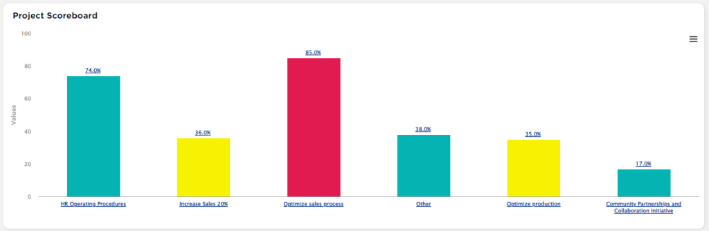
- ScoreBoard: This is a drilldown column chart showing Factor numbers by category scored on a relative curve (top performers, median performers, low performers).
People Analytics
People Analytics is a view that contains a series of reports. The typical audience for People Analytics are HR professionals. However, because of our Reports To structure, managers may be granted access to run these complex reports for their people.
Learn more about People Analytics here.
Project Reports
If your Role has permission for “Visualize Projects” you have access to two more reports that showcase project status from a higher level.
Project Reports
Project Status is also shown in Project Reports for those who have that permission in their role. These include a stacked bar chart listing the number of Tasks assigned to each employee by status. There is also a drilldown column chart showing the Initiatives, Projects within those Initiatives, down to the Tasks within those Projects.
Gantt Chart
There is also a report which collapses projects and tasks into initiatives and overlays them in a Gantt Chart. Click the “>” chevron on the left to expend/collapse each. If you drag & drop them horizontally, it’ll automatically update the start and end dates for you.
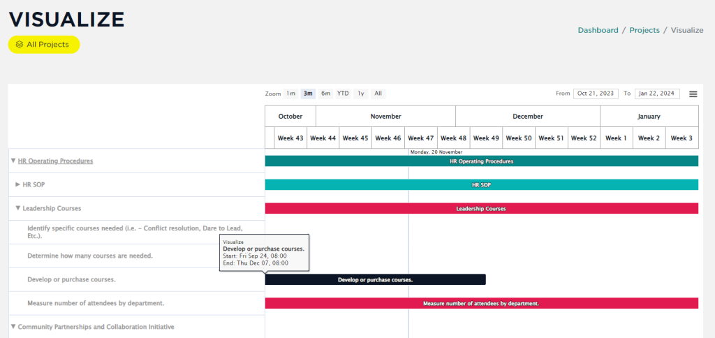
The vertical blue line indicates today’s date.
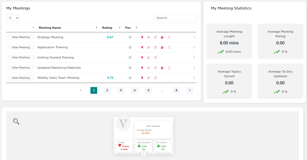
Meeting Reports
There are two levels of reports for meetings. From “My Meetings” you’ll see statistics based on the average of all meetings you have accepted invitations to. Below that, you’ll find similar meeting statistics based on Reporting Structure.
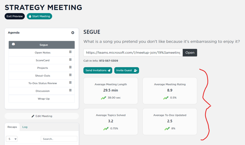
Going to any meeting’s “Meeting Preview” you’ll see statistics about THAT meeting below the Segue section of the meeting preview. These statistics are not visible to Guests or in the meeting once it has started.
UP NEXT: Working with Embeds


