The SecureDB Scorecard provides users with a powerful tool for visualizing and analyzing Objective data. This guide will walk you through the steps to navigate, access, and filter data using the Scorecard.
Accessing Objective Data
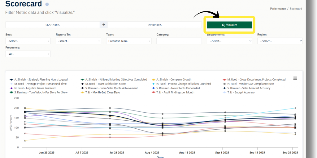
To access data from the Scorecard:
- From the navigation bar, select Performance > Scorecard. This will open the blank Scorecard view, ready to populate with Objective data.
- Click Visualize.
- The default Scorecard view will populate with all weekly Objective data for the last thirty days for the logged-in user and any users reporting to them.
- Review the data:
- Line Graph: Displays trends and progress for each Objective.
- Data Table: Below the chart; shows detailed Objective data which can be updated by entering values in the cells.
The combination of graphical and tabular data offers a comprehensive overview of performance.
Utilizing Filters
Filters allow users to customize the data displayed on the Scorecard. Here’s how to use them:
- Select a Date Range:
- Use the date range picker to define the period for the desired data.
- Apply Filters:
- Use one or more dropdown filters to tailor your view (details on filters below).
- Visualize Data:
- After setting your parameters, click Visualize to generate the customized Scorecard view.
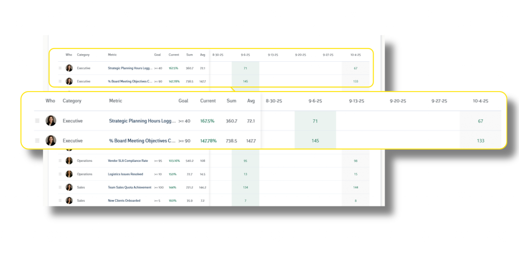
The image below depicts a Scorecard view filtered for role and Category with a date range for the month of December.
Filters and Their Functions
Each filter has a specific function to help you target the data you need:
- role: Displays data for users in a selected role, providing insights specific to job functions.
- Reports To: Filters data for a selected user and all individuals reporting to them, ideal for managers overseeing multiple teams.
- Team: Narrows data down to specific Teams for a focused view of collective performance.
- Category: Targets specific Objective categories, such as sales, customer satisfaction, or Project deadlines.
- Department: Filters data for selected Departments, supporting cross-departmental performance analysis.
- Region: Displays data for users within a selected geographical Region, useful for distributed teams.
- Frequency: Displays data based on Objective frequency (weekly, monthly, quarterly, yearly).
Users can mix and match these filters to achieve a highly customized view of Objective data.
Data Table Layout
Within the Scorecard, you will see a row for each Objective. Moving left to right across rows, you’ll see the following:
- Avatar of the user to which this Objective is assigned
- Objectives category (only seen on very wide screens)
- and the Objectives name. The Objective name may be abbreviated if it is very long. To see the whole name, hover over the title or click the title to see the whole name in a modal window.
- Objective orientation and value(s)
- Current score for the Objective. The default view is the percent of the Objective reached, but you can toggle to the actual number by selecting “Show Actual” to the top right of the line chart.
- Sum and average scores automatically calculated for each row visible in the current date range.
- Objective values. Values for each Objective for the respective frequency period selected.
Entering Data
A sliding table sits behind the left side of the table and displays Objectives for the selected frequency; columns also match the frequency. The column all the way to the right is the most current period. Tiles will be green if they match the desired value(s) of the Objective, and tiles will be red if they are not within the desired value(s).
Each time you click away from a table cell, that new value is saved. That’s why there is no “Update” or “Save” button when the Scorecard is viewed on a wide screen.


